Graphing Display
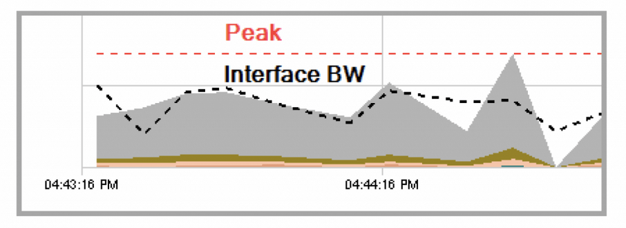
• Stacked area chart displays the data shown in the legend. If the policy is hierarchical, the child policy class information is charted in the class and class drop views.
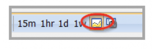
• Black dotted line represents the interface bandwidth from the IF mib and is shown to help for correlation purposes. Since the IF mib operates separately from the CBQoS mib, the lines may not align especially at 10 second polling rates due to when the mib may be updated by the device. To turn off the line using the toolbar button.
• The red dotted line represents the peak bandwidth.